I used my different images to make my custom background. I used the tools in photoshop to create a metalic clean looking background, with added detail around the sides. And I toned the whole background to be lighter in the middle to attract the eye to whats important on the cover.


 Here I am creating the buttons using the gradient tool, to create a 3d metalic looking button, and I have used a boarder on the box, and also have the text prepared to include with it.
 To turn images into functional buttons requires turning it into a button, and then choosing settings of how you want it to react when and mouse interacts with it.
 Flash uses many different channels and frames to build your work on, using "keyframes" which tells the program which keys will display what infomation.
 This is the page with the students, which as a group we took photos of the class in the studio, and added a name tag to each one. I made these into buttons so they rediret the flash movie to the individuals webapge.
 This is my individual page, and I have used a "Roll Over" system which i programed to work when the user hovers the mouse over a given image/text. There are 3 work examples, and when you roll the mouse over each of them the image of that work and a discription pops up without the user needing to click.
 Here shows the initial programing of the "Roll over"
 This here shows the ActionScript, which is the coding that tells the movie what to do, and act like a webpage. This coding I had to research and learn what it does, and apply it to my webpage in the correct place. This took alot of trial and error, firstly it being my first time doing this, and also tutoring myself.


It is crucial for us to choose the right kind of exhibition stand for the display. This choice will help us to maximize the effectiveness of the exhibit in the best way possible. There are a number of different kinds of exhibition stands on the market that I have found shown bellow.
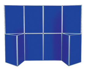
1. Traditional Stands - These stands were the ones that have been used for many decades now and the mechanism is very simple. Essentially a traditional exhibition stand consists of a couple of rods that are firmly rooted in the ground. In between these rods, there is some sort of platform that is places so that the exhibitor may display the exhibit on it. Although there are many different types of exhibition stands available nowadays, this still remains a popular stand to use.
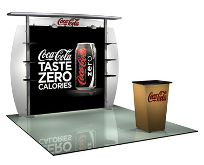
2. Modular Display Stands - These types of stands is very popular among exhibitors, with these types of stands offering versatility for exhibiting. What the term literally means is that there are a number of individual components that fit together to form this exhibition stand. The most common types of modular displays are the table top displays, point of purchase and portable displays.
3. Literature Stands - These are much specialised and ones that help the exhibitors set up displays for different kinds of literature. Essentially, a literature stand is like a portable bookshelf that has various shelves that will allow the exhibitor to place a number of small items on different levels. These stands are very useful for ensuring that you leave a lasting impression on the exhibition attendees, by aiding them in walking away with branded materials about your business.
4. Banner Stands - Banner stands are a relatively new innovation and allow the display to hang from the stand. There are many different kinds of banner stands, which include roller banners, cassette banners, rigid banners and motorised banners. These stands are very easy and quick to assemble and come in a variety of styles and designs.
5. Pop-up Stands - These stands give exhibits a more artistic appeal and are a portable option for businesses to use. This type allows for a lot of versatility and there are a number of add-ons that can enhance these stands. These types of stand are also very portable, easy to put up and wonderful for branding.